Information Architecture & Content Analysis
DePaul University, MS, HCI Program student work. Produced in Created in Sketch and InVision.
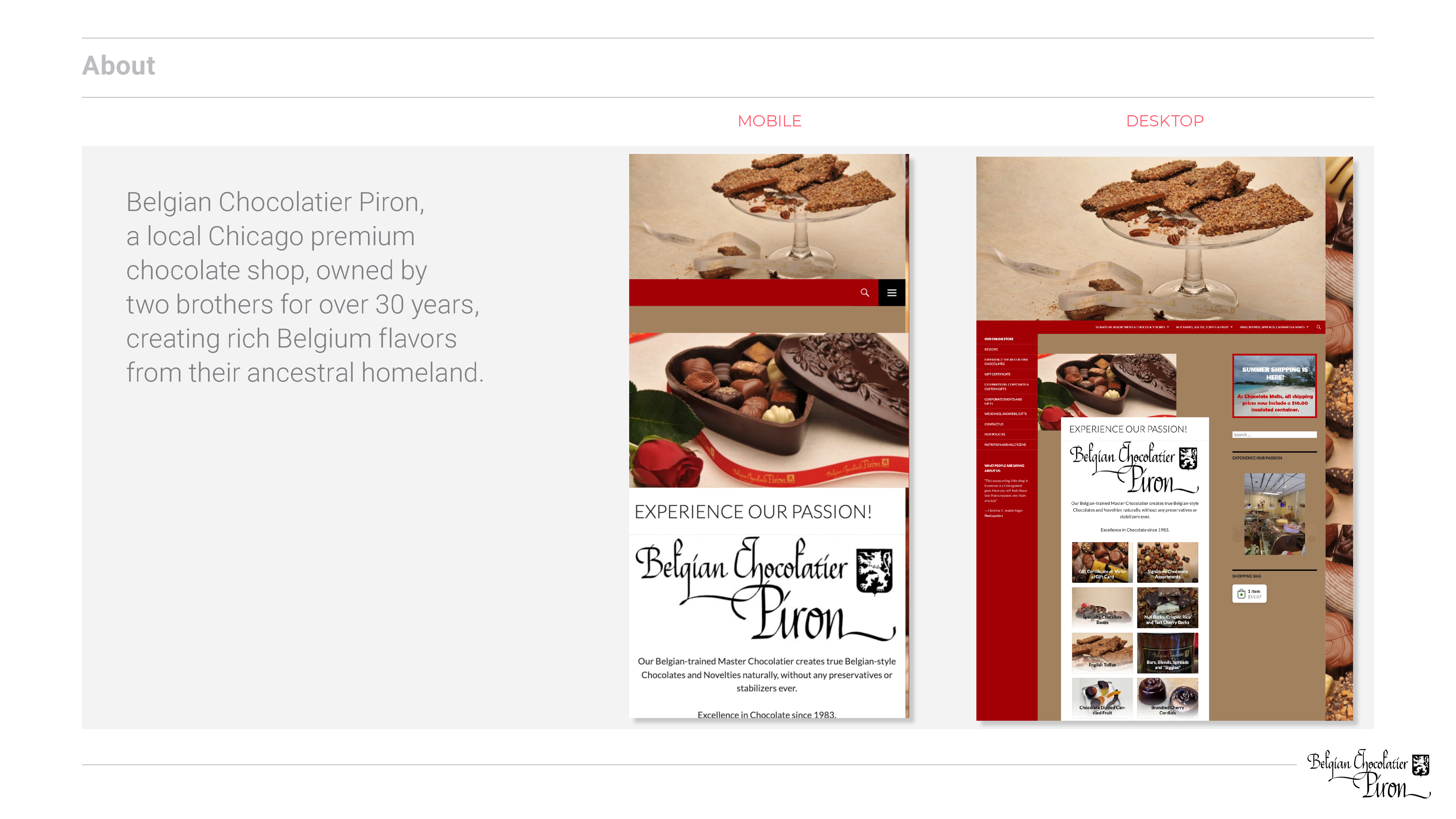
Piron Chocolatier
Took an existing site and conduct UX research, content analysis, user testing and develop a better navigation solution.
My Role
Team of one: I preformed all the foundation work, content analysis, research, testing, data analyzing, creating user flow, hierarchy of content and navigation, wireframes, presentation deck and presented the work.
Objective
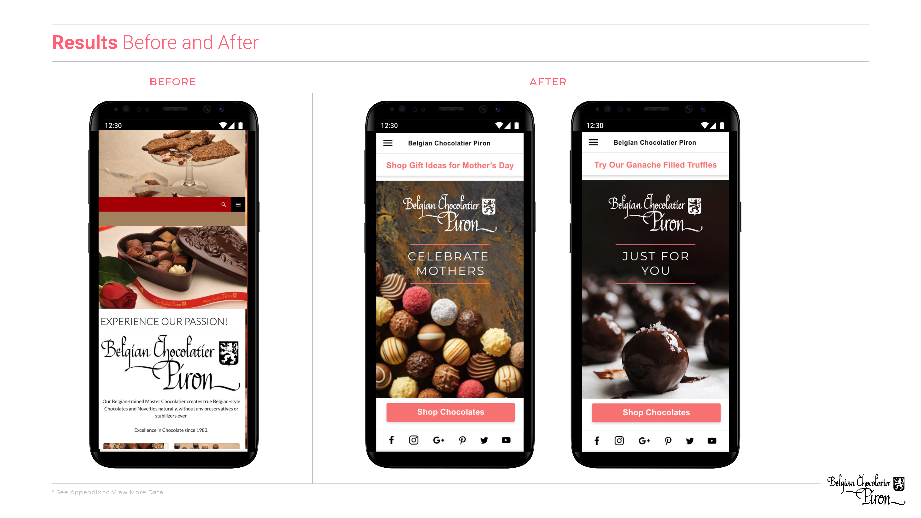
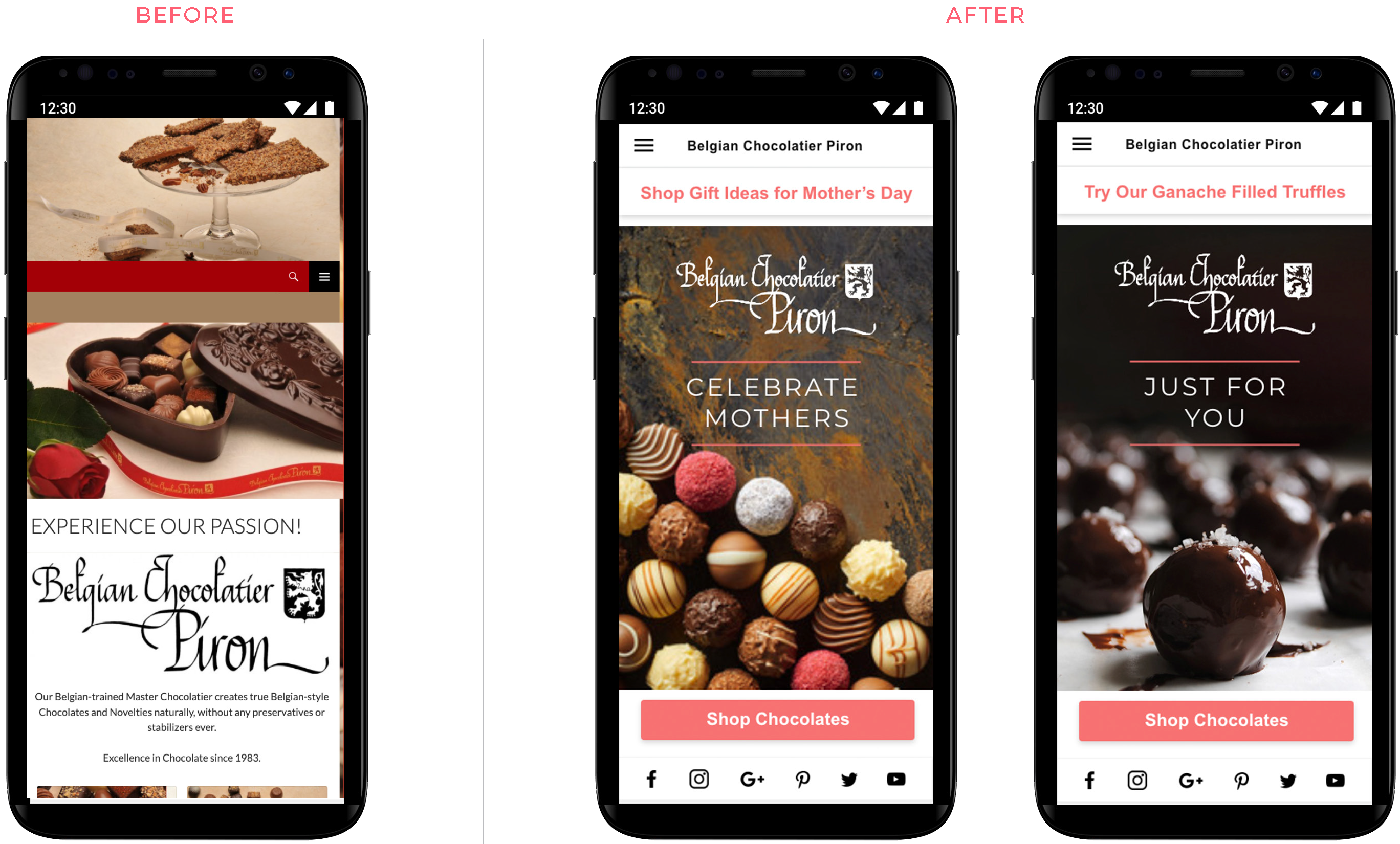
Create a smarter navigation and a cleaner elevated design. Build cohesive templated pages to allow for easy updates and location predictability for the user. The positive results will be reflected in repeated purchase reporting, increase of sales, and customer reviews.
Process
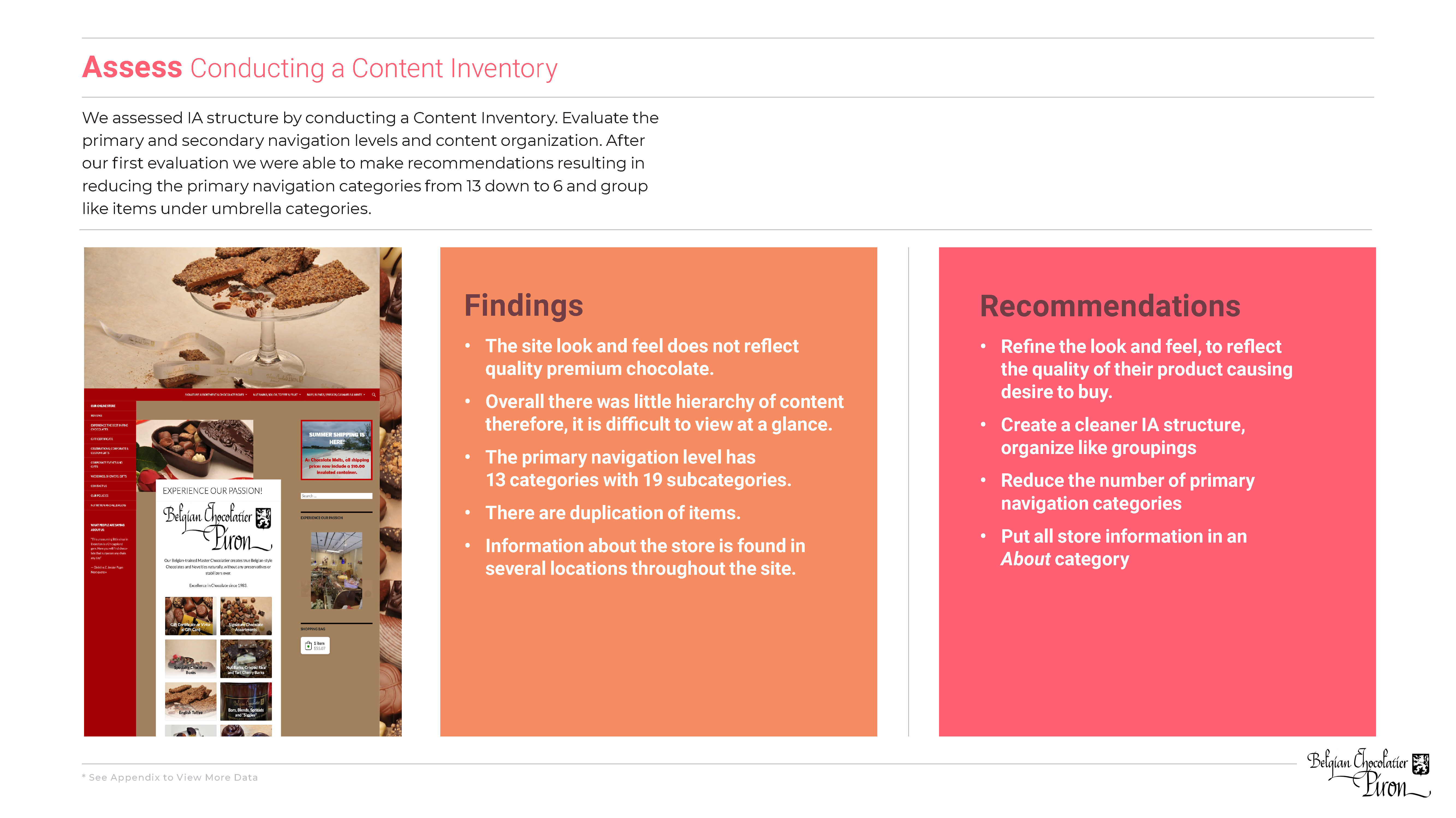
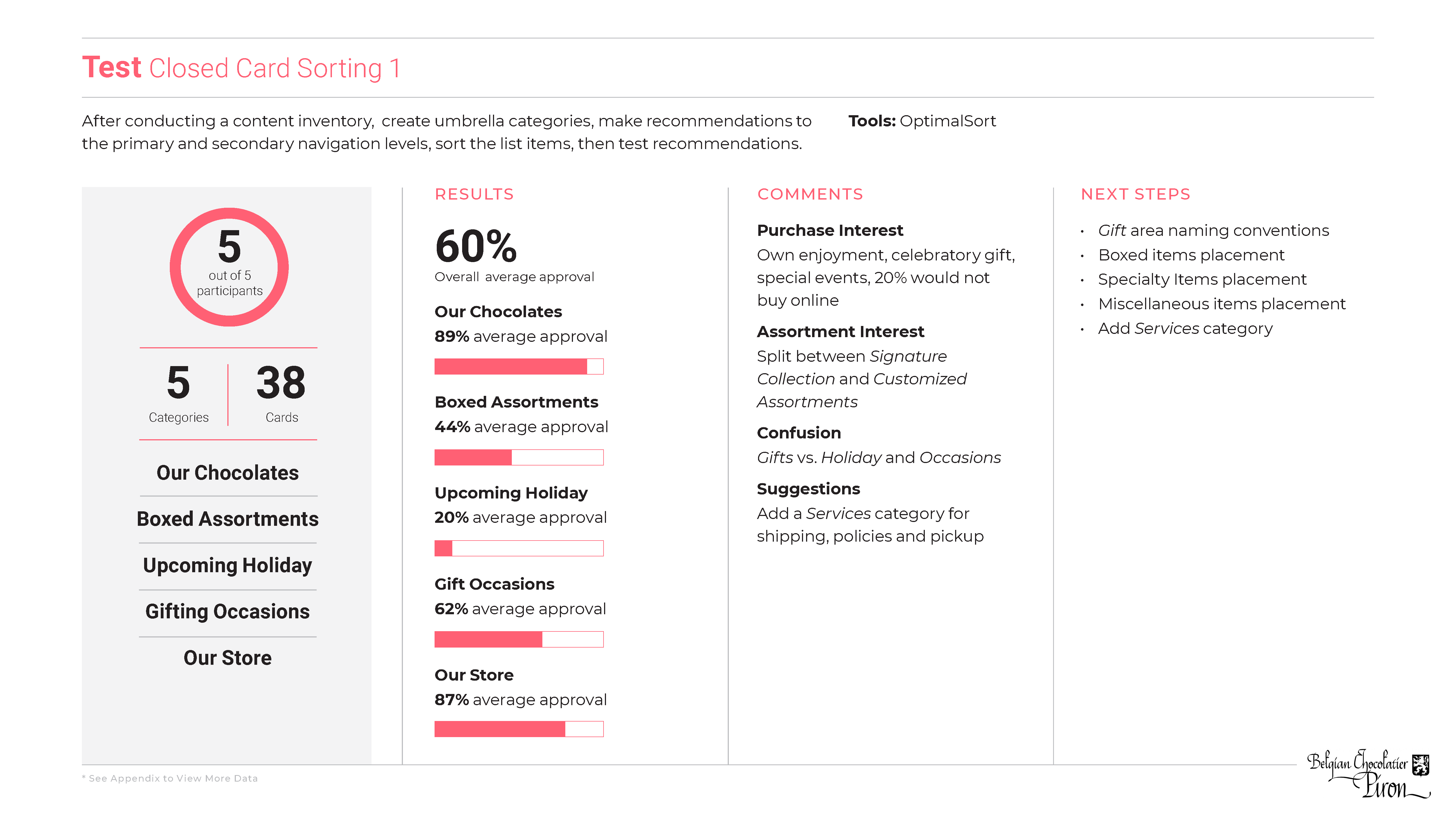
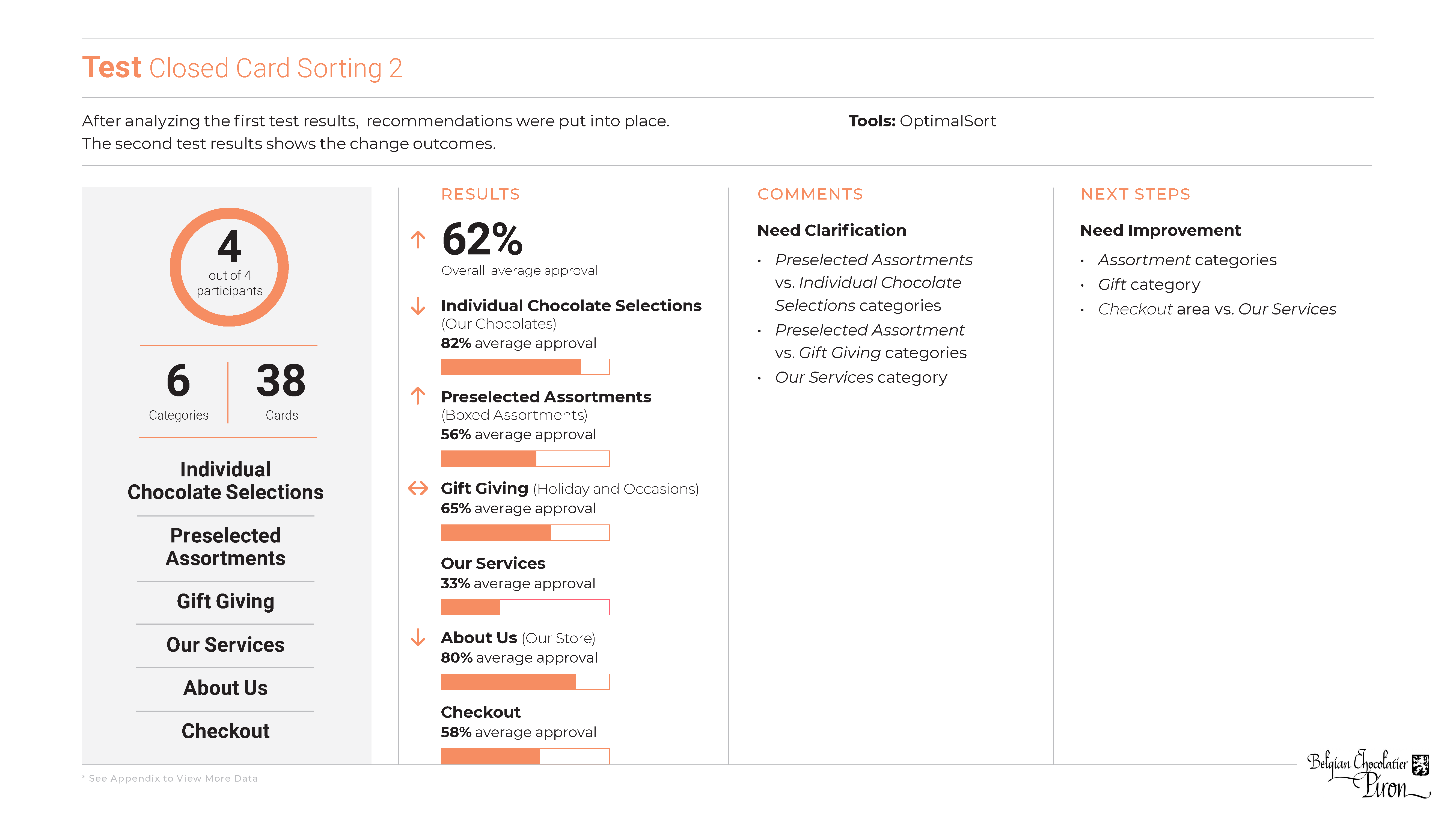
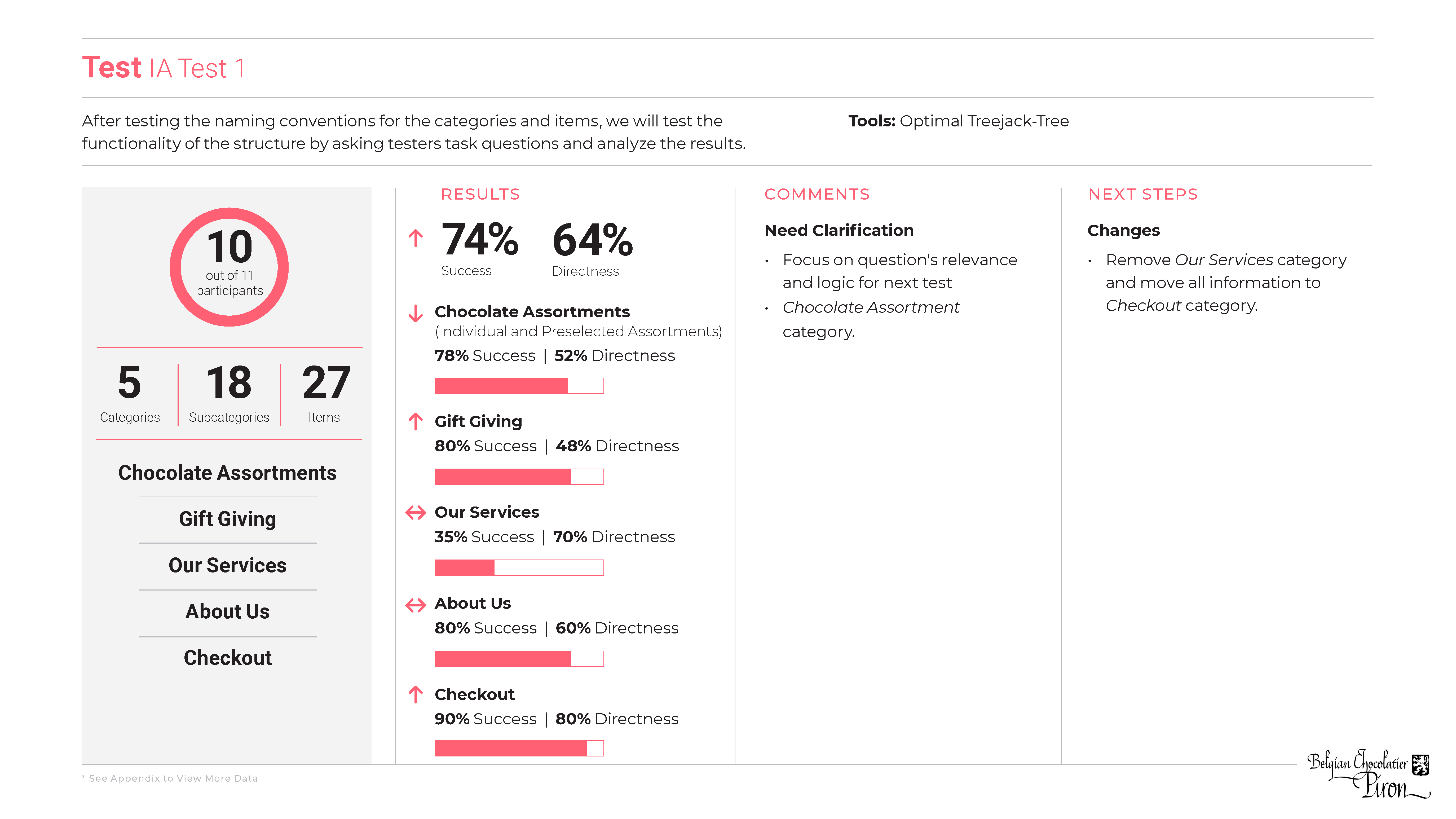
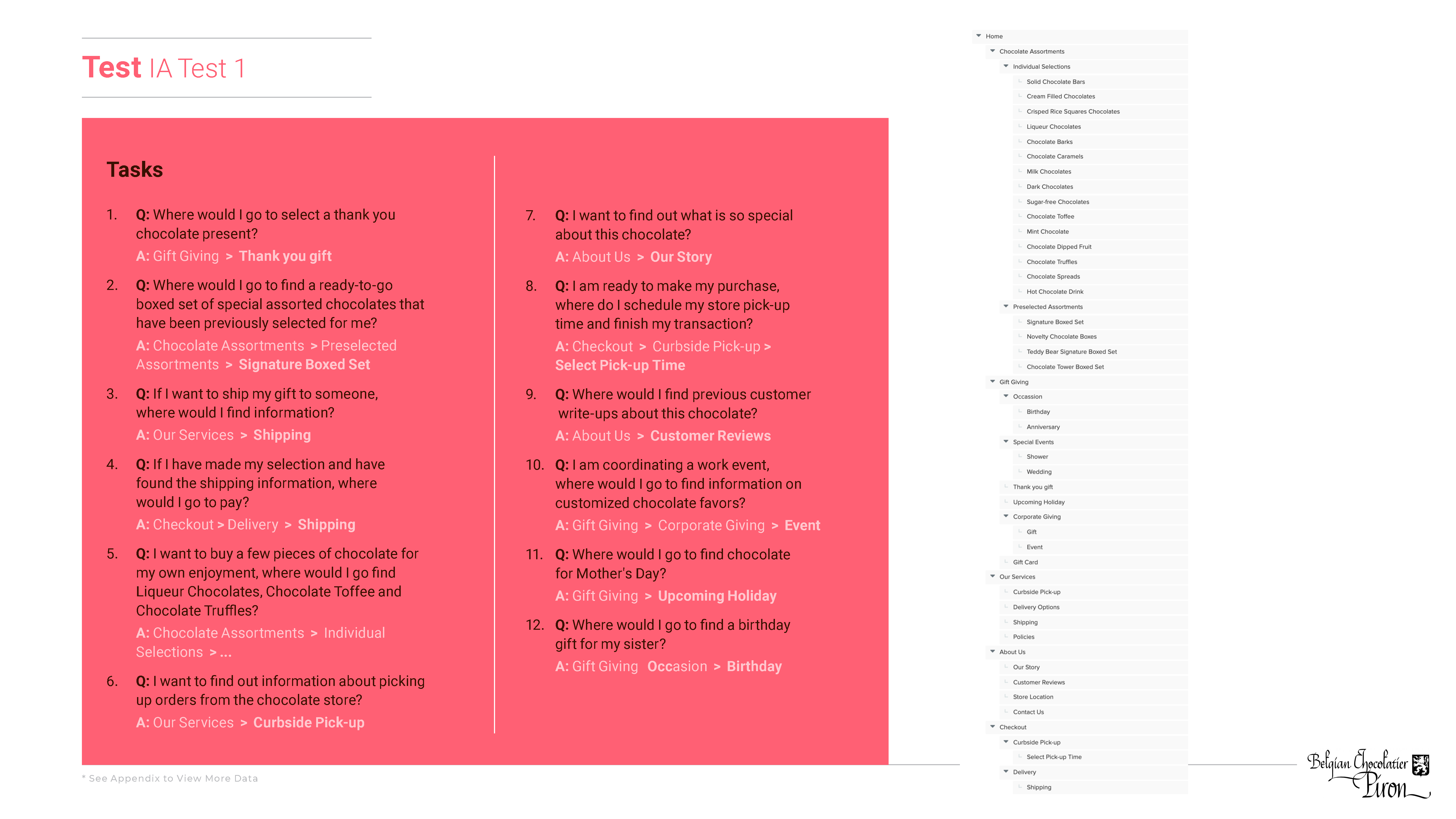
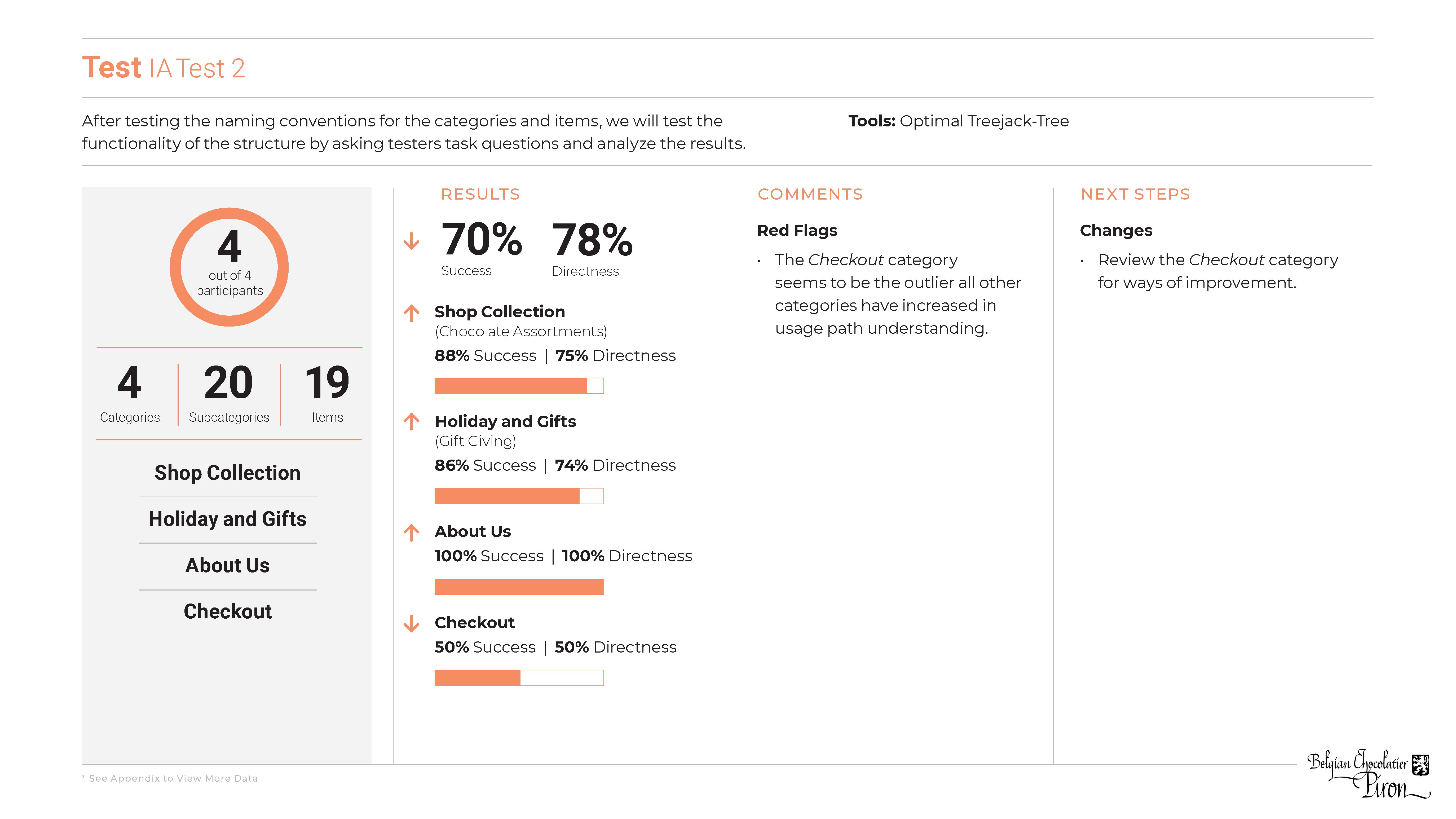
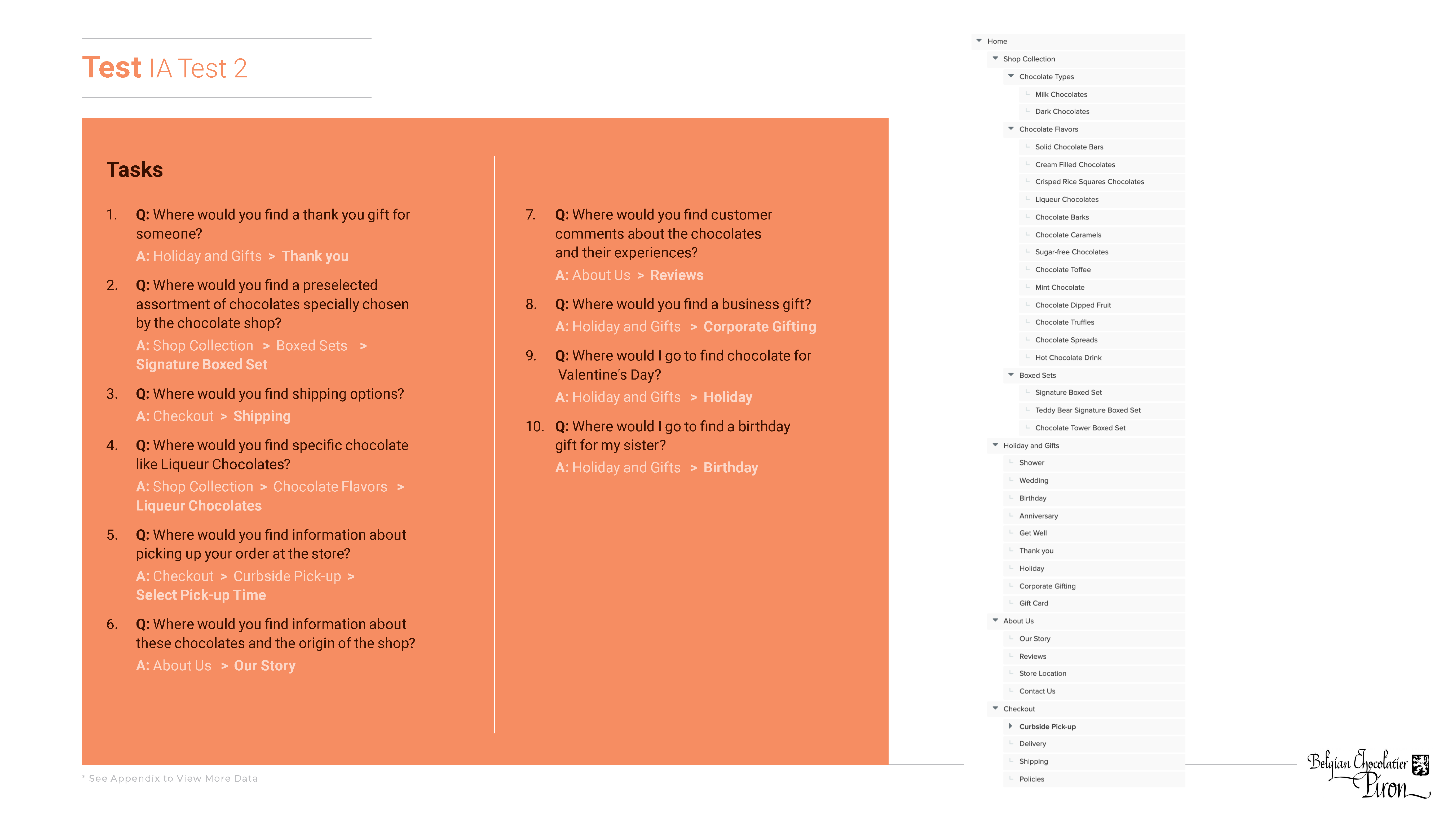
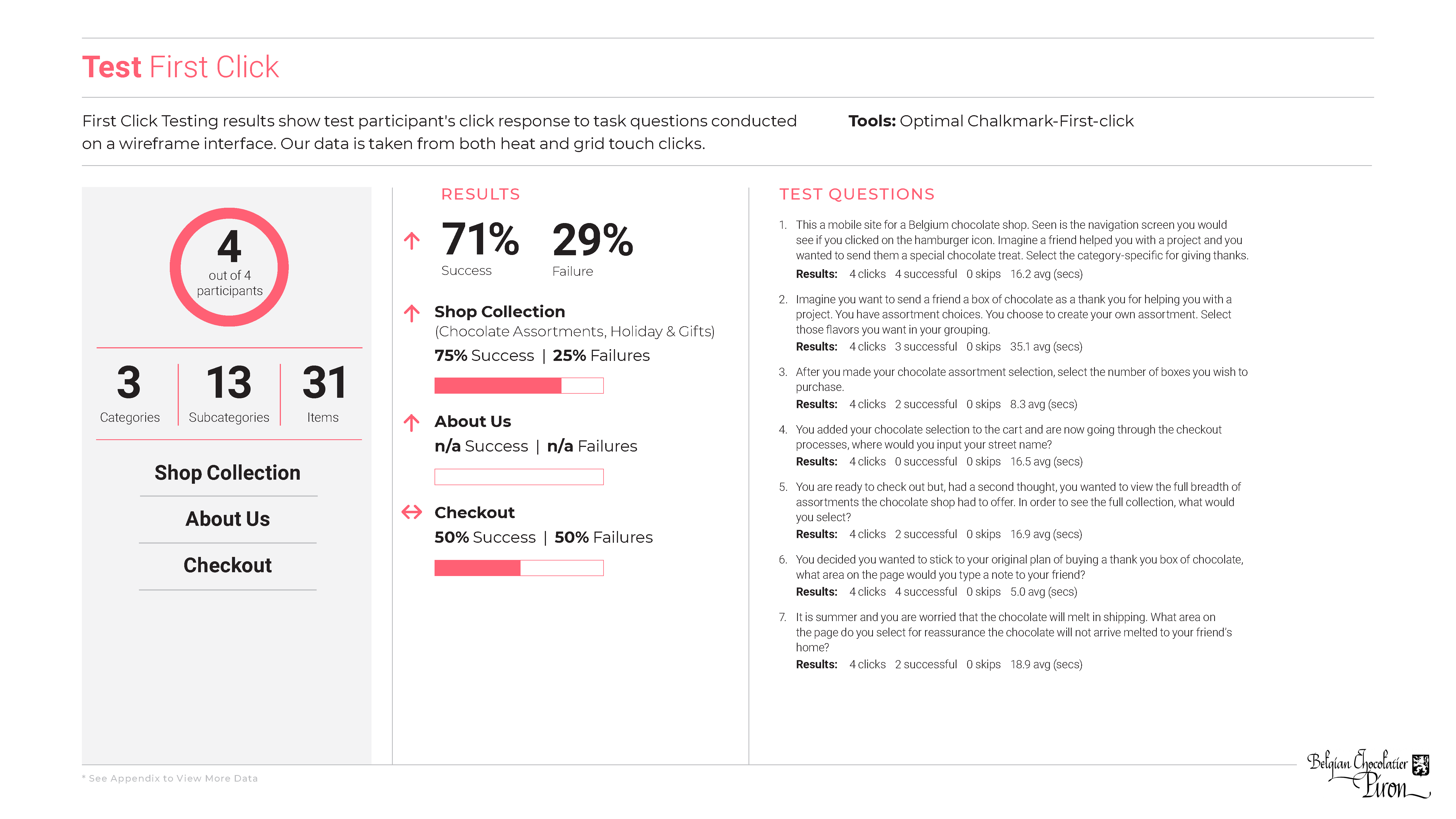
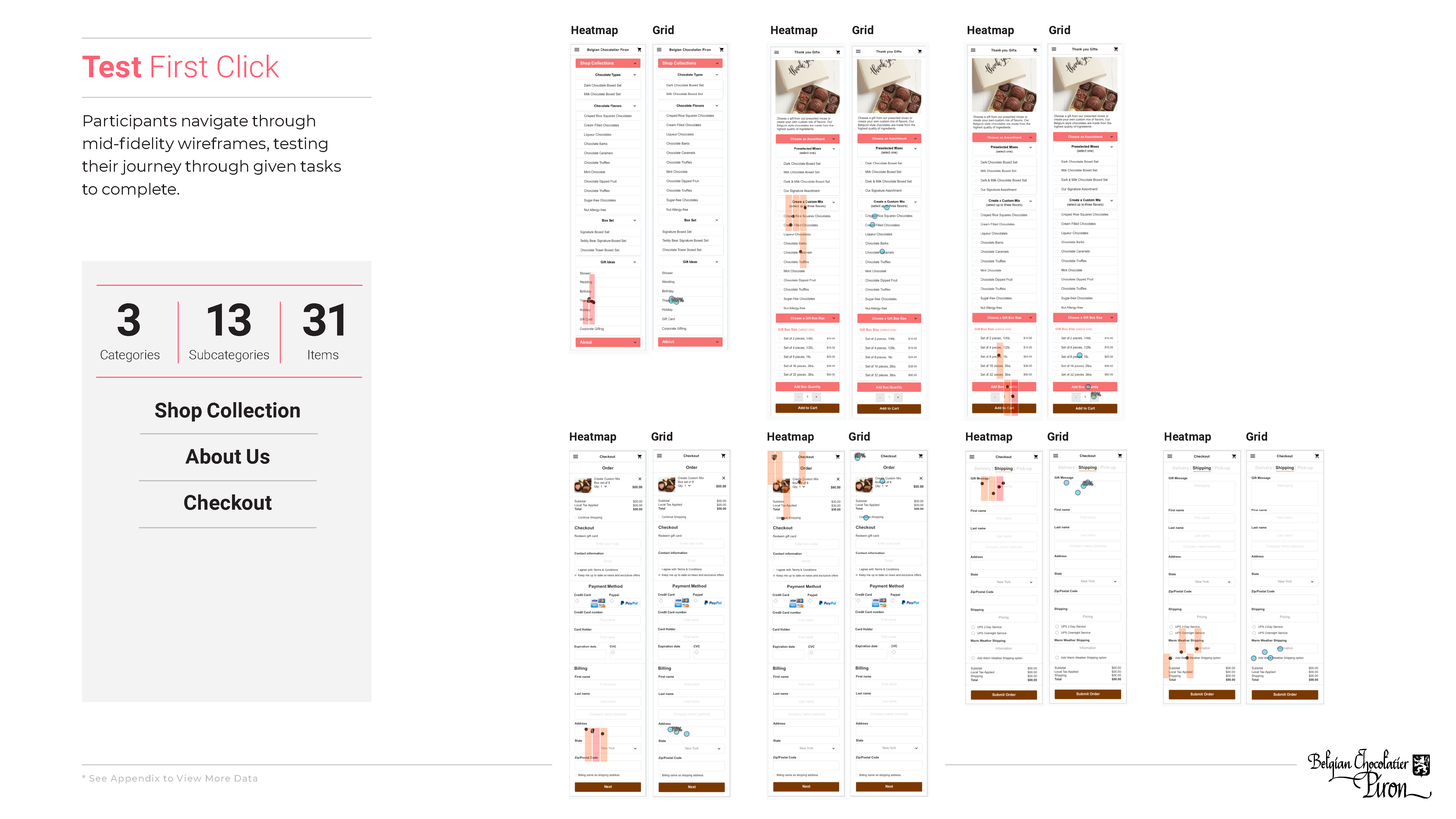
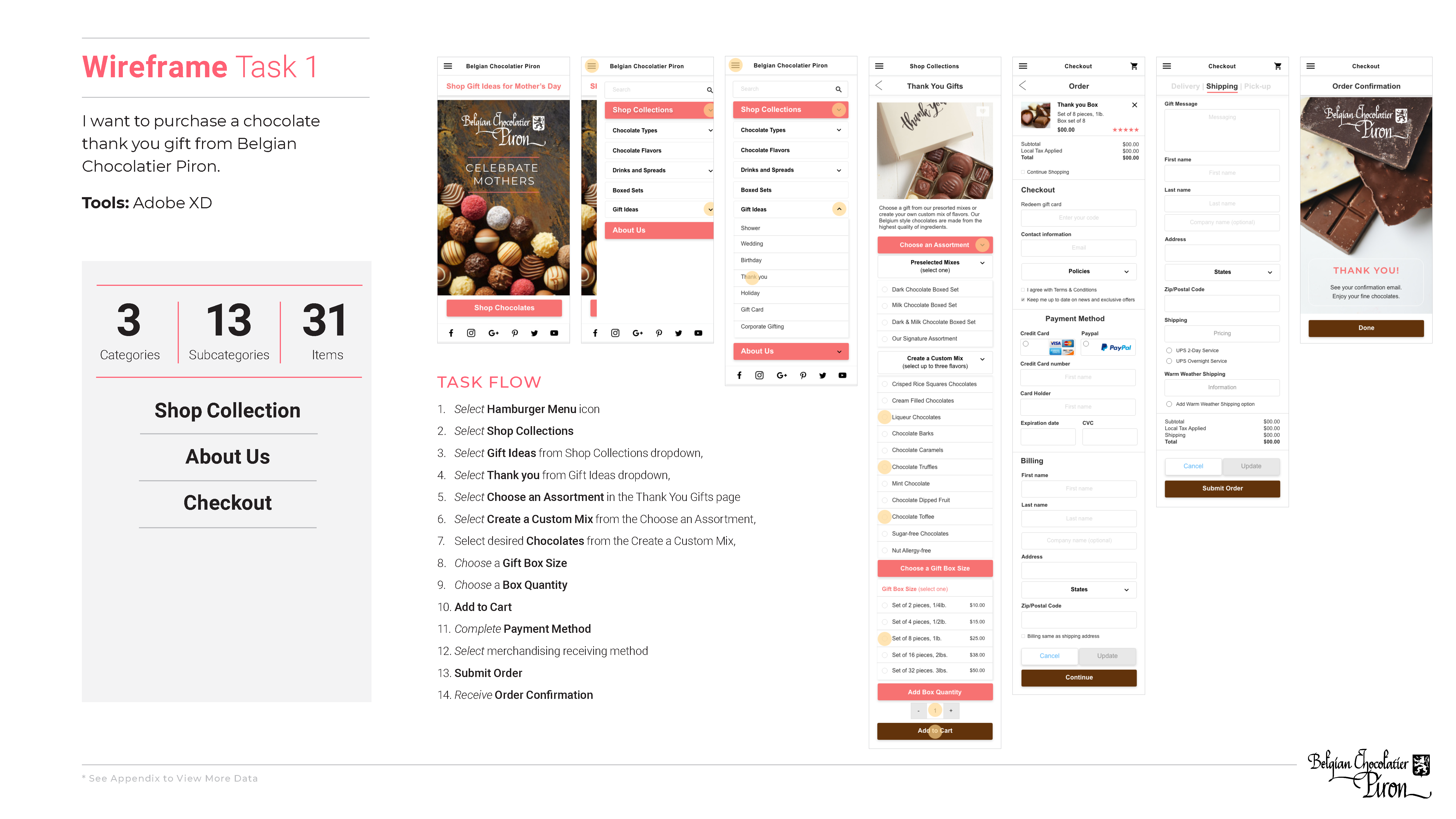
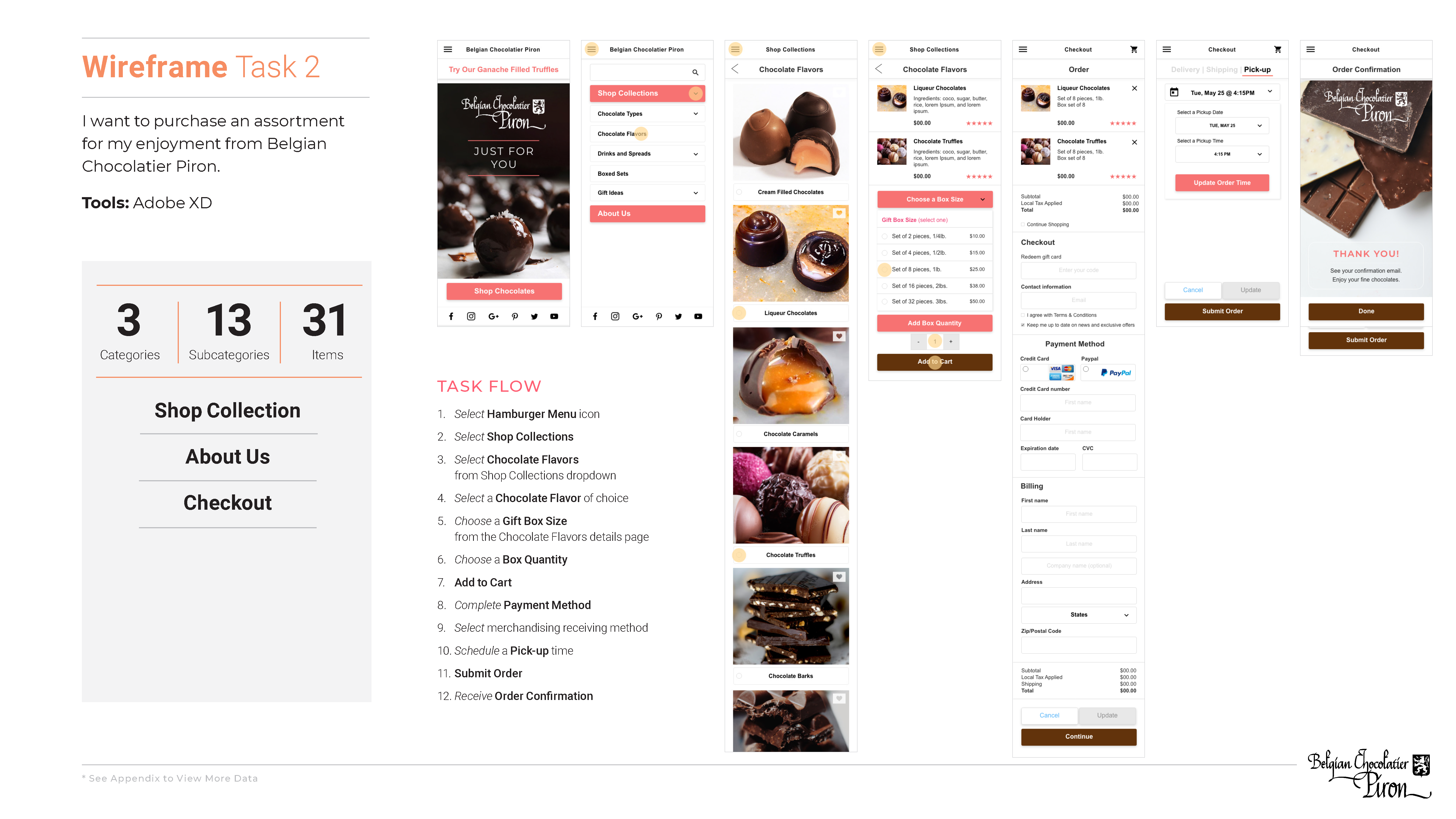
Improvements to the mobile experience, are achieved through IA and CS methodology. In conducting content analysis and inventory, the primary and secondary navigation findings gave insight for recommendations. These recommendations were tested by conducting card sorting exercises, followed by category and naming convention IA testing. First click testing assisted in noting the user's navigation path routes. From testing data, a new sight map was constructed for screen pagination and wireframes where built to test task based navigation interactions and usability.
Conclusion
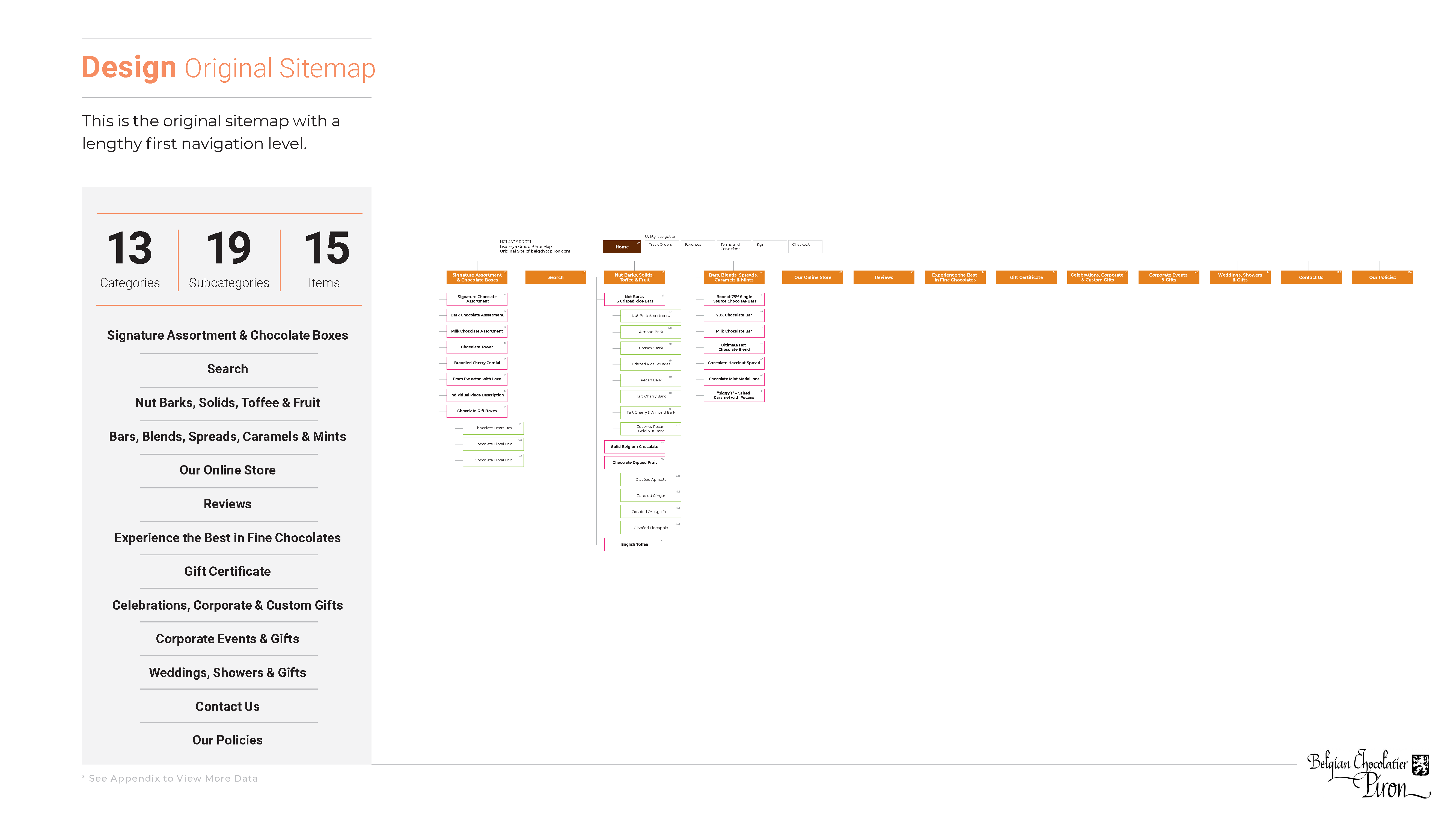
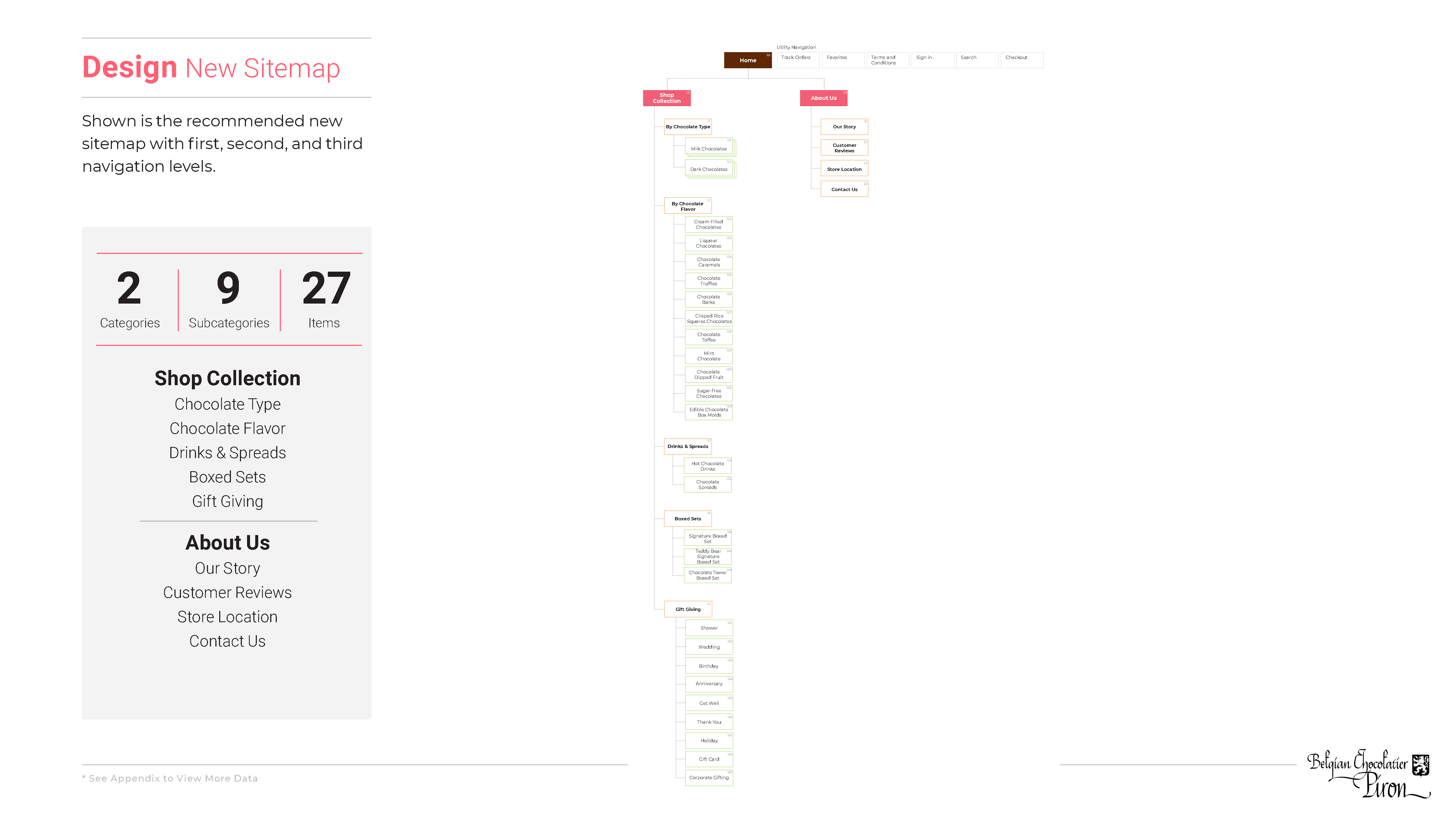
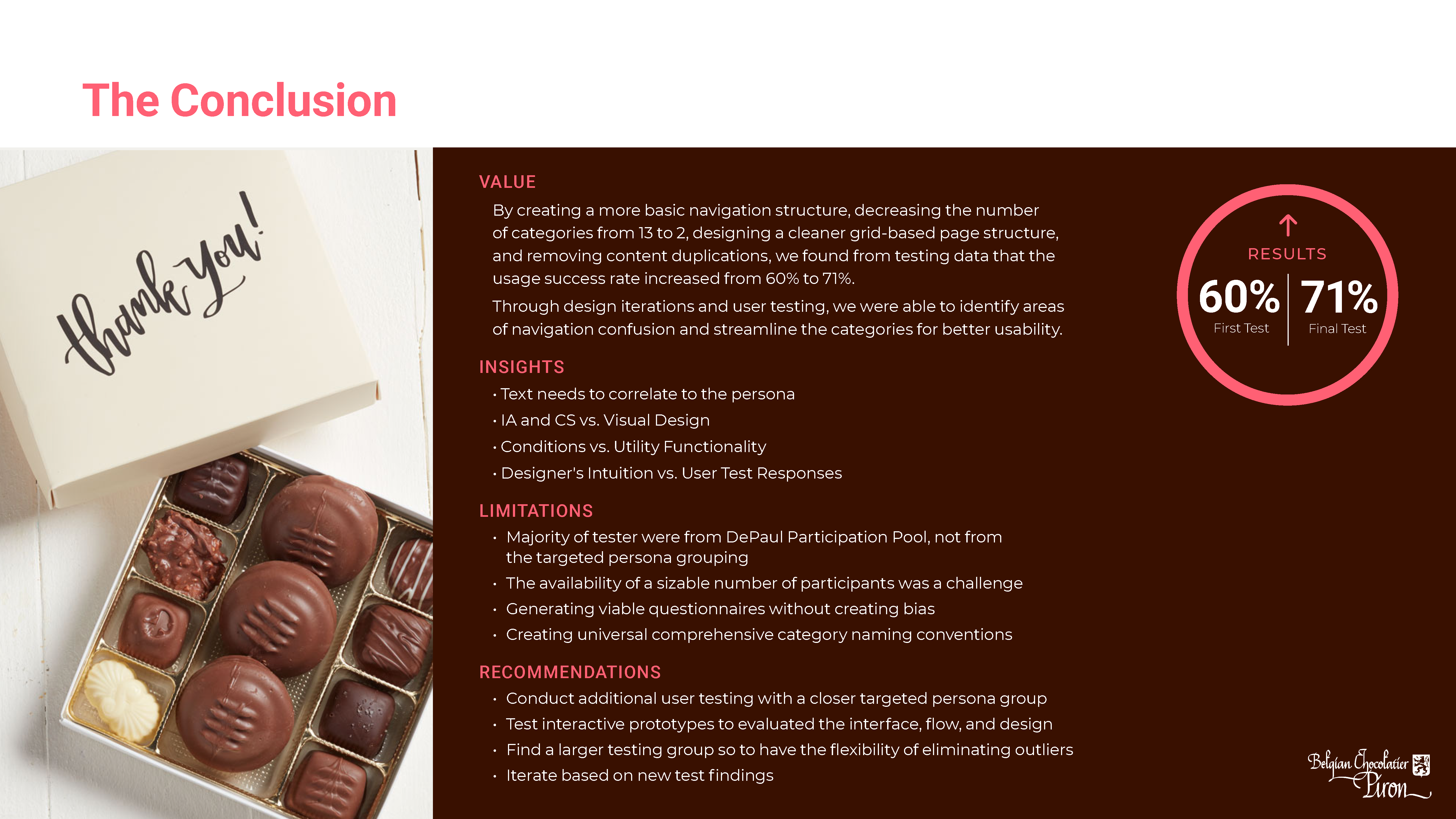
By creating a more basic navigation structure, decreasing the number of categories from 13 to 2, designing a cleaner grid-based page structure, and removing content duplications, the testing data findings showed the usage success rate increased from 60% to 71%. Through design iterations and user testing, we were able to identify areas of navigation confusion and streamline the categories for better usability.
Prototype: Home Page
UX Process
↑ Scroll up to view more.
